Since the arrival of digital cameras, photographers have avoided the decision of whether to load colour or black and white (B&W) film into his or her camera when setting out for a shoot. Digital cameras allow us to switch with ease between full colour and B&W image outputs. Futhermore, we even have the option to alter our decision after the fact, assuming that we are shooting in RAW and keep the original files straight from the camera’s sensor – .CR2 for Canon, .NEF for Nikon etc.
With so many options available for creating images in monochrome, it’s sometimes hard to know when to use B&W as a creative tool, so we’ll take a look at thatv in this blog.
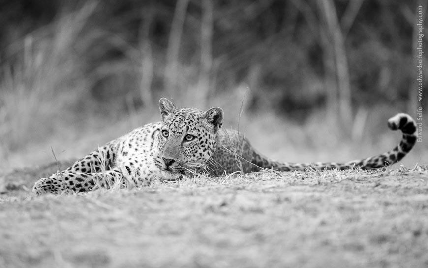
Sometimes the decision of whether to convert to B&W is fairly easy. In the situation below, this leopard only started to show his playful side after the sun had set and the light levels had dropped very low. The resulting images were very short of contrast and had the unusual pink hue that comes from the camera’s misinterpretation of the white balance setting. Some of this can be recovered on a computer, but the colours will never be of good quality, so I chose to convert to B&W to avoid some of these problems; the result is an image which is definitely worth keeping, whereas the colour version is probably not!
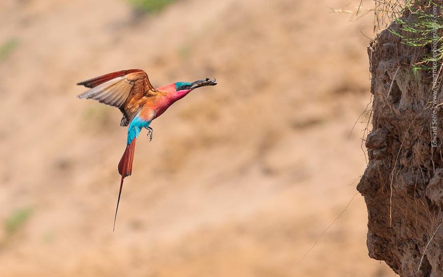
In other cases, it’s easy to see that a B&W conversion will not likely be the best solution. In the following images, the colour is crucial to the image, and they make poor monochrome conversions….although I was surprised how much I admired the Carmine Bee-eater’s elegant shape when the colour was removed – something I hadn’t noticed before.
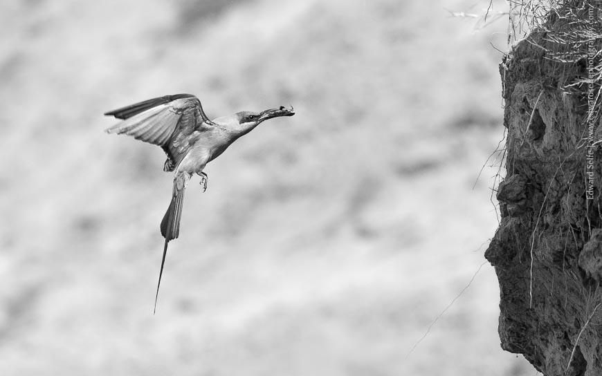
I mentioned above that I had admired the elegant shape of a bee-eater delivering food to its nest in the river bank. I think that reveals a crucial quality that successful monochrome images must achieve; the shape, texture, patterns, lines and form of the image must be pleasing in their own right, without the need for colour. Examples are endless: zebra stripes, repetitive patterns of windows on buildings, elephants’ skin, classic architecture, leopards’ spots and many others. Images of all of these have been regularly converted into very successful monochrome results.
I have chosen a few of my favourite images and put colour and B&W versions side by side. Before each, there’s a short discussion of the story behind the image, and how it came to be.
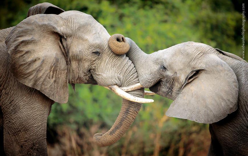
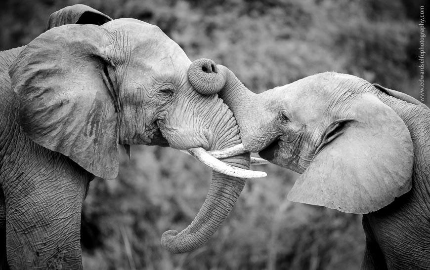
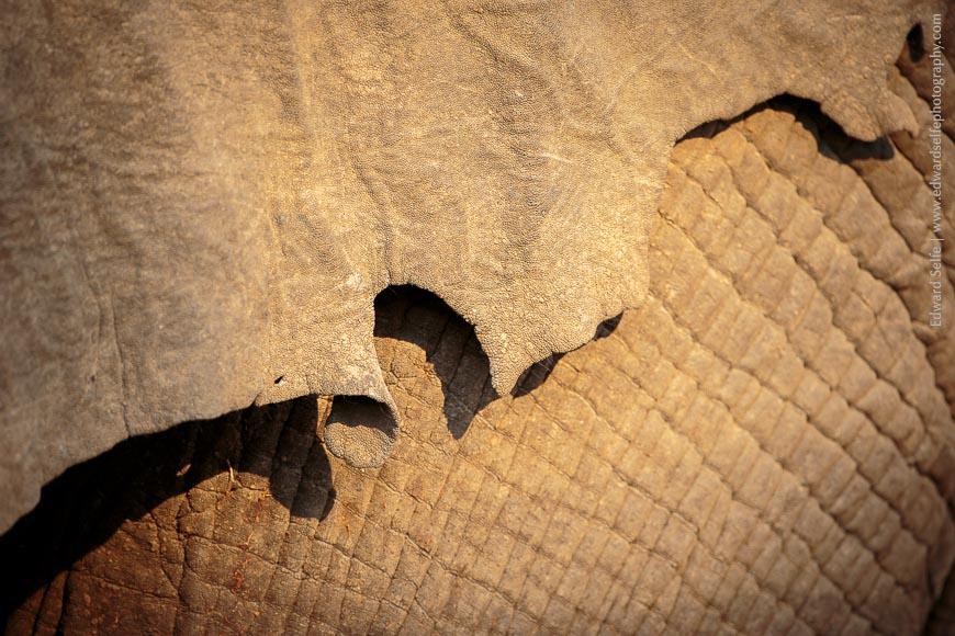
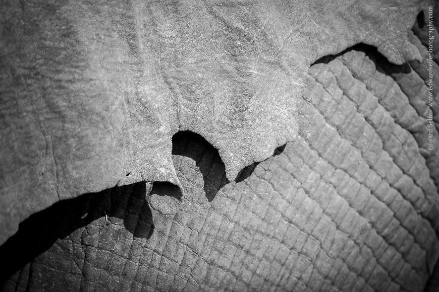
As I said before, elephants’ hides are highly effective in monochrome images because there are wonderful textures and creases, and there is often little colour information lost in the conversation! These two bulls were sparring on an overcast day and I knew that the colours would be weak and the contrast low. I knew at the time, though, that this would convert well to B&W, particularly with a little added contrast.
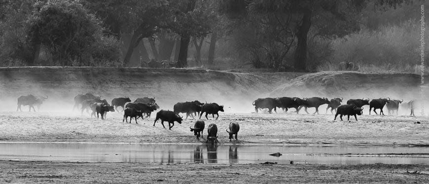
This is an interesting image because I find that it is strong in both colour and B&W versions. In fact, I can hardly choose between them; the colours are beautiful and add to the overall effect but the shapes and contrasts in the monochrome version are also striking. When I took the photo, I hadn’t considered this as a B&W image but I experimented with a conversion on Lightroom.
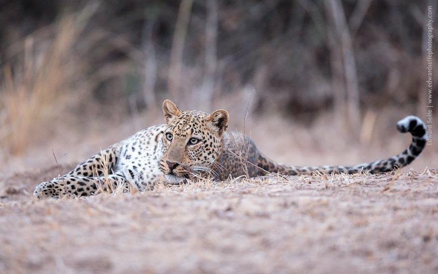
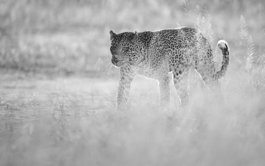
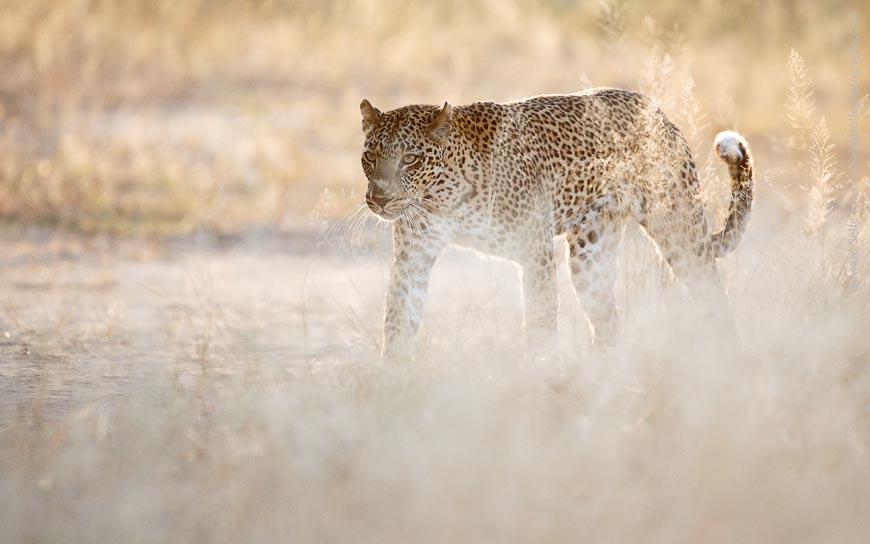
This leopard image is all about the shape of the cat: it is backlit, blowing out the details of the grasses in front and leaving little detail on the predator’s face and flank. But it’s undoubtedly a leopard thanks to that curled-up tail tip and low-slung shoulders that are unique to the species. In this case, I think the monochrome conversion is a far better image.
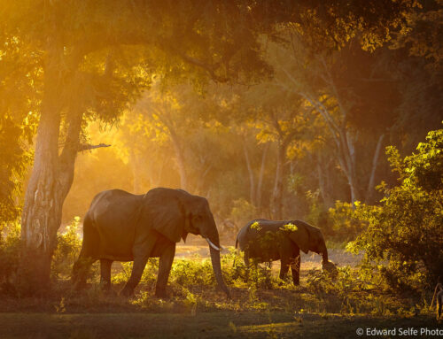
This impala image is made special by the stunning trees in the background. They set the scene for the calm idyll in the foreground. (Little did they know that one of their number would be taken by a leopard from the very spot where they currently feed less than 30 minutes later! True story!)
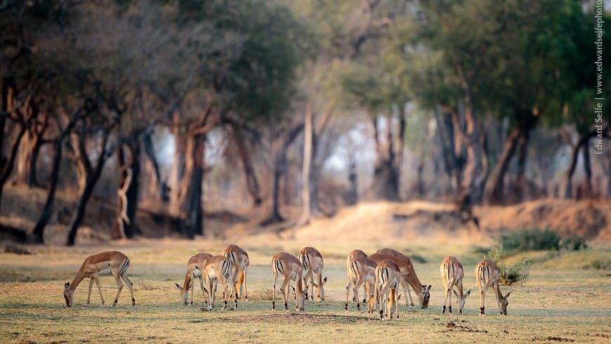
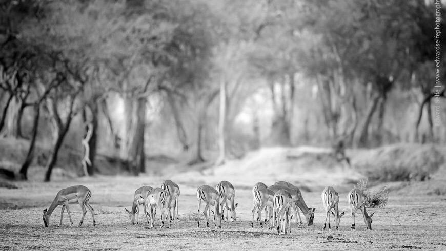
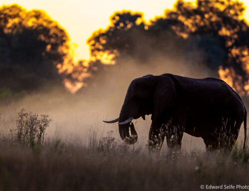
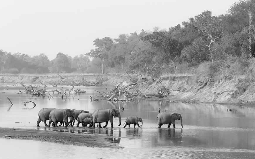
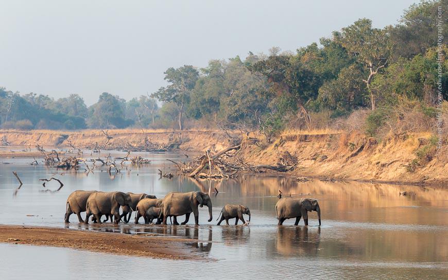
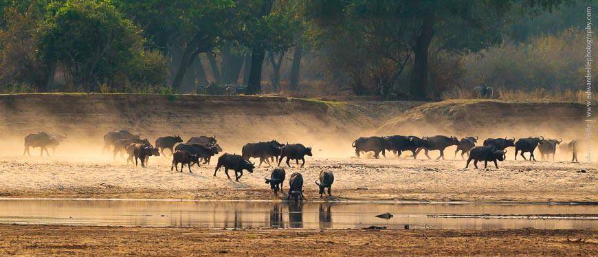
This image works well in both versions, however I think the colours are so rich and warm that it is a shame to sacrifice them for the monochrome version. And though the dust clouds look more pronounced when the colours are removed, the shapes, which are normally more apparent in monochrome don’t stand out more than before. In this case, I would keep both images and use them for different situations.
Finally, an abstract. We managed to get really close to this sub-adult bull elephant while he was scraping tamarind leaves from the ground. The evening light was spectacular and we spent over 30 minutes with him, taking chances at different angles as he turned, fed and turned again. I made the B&W conversion for this tutorial, just to experiment with shape and form and see how it translated to monochrome.
Black and white photography is an art in itself; as we have seen, converting a colour image – even a good one – to monochrome doesn’t make a good B&W photo. Often B&W conversions can be used to “save” an image when the light was harsh or unflattering. But a truly great B&W image will probably be “seen” in monochrome by the photographer before he even presses the shutter, having taken into account shape, form and texture and the role they will play in the final image.