For me, the purpose of having a grasp of camera settings and post-production techniques is to allow me to best capture the beautiful sights that I see, not to falsely exaggerate them. After all, in the bush there’s little need to overstate the beauty of wildlife; all we have to do is represent it faithfully.
As we discussed in a previous post about cameras’ limitations we know that cameras cannot capture exactly what we see. The camera’s sensor is also not as accurate at judging colour as we are, which occasionally leads to your images having incorrect colours.
We call this unusual colouration a “cast”, and it can be of any combination of magenta (pink), green, cyan (blue) and yellow. If you have ever taken a photo of people under fluorescent lighting and seen that they appear green or pink, then you will know what we are talking about!
This occurs because the camera doesn’t accurately judge the wavelength of the light hitting the subject. Compare it to the way that we see a blue tinge on white t-shirt in a night club which uses UV lights. So what do we do about this?
Step 1: Your Camera
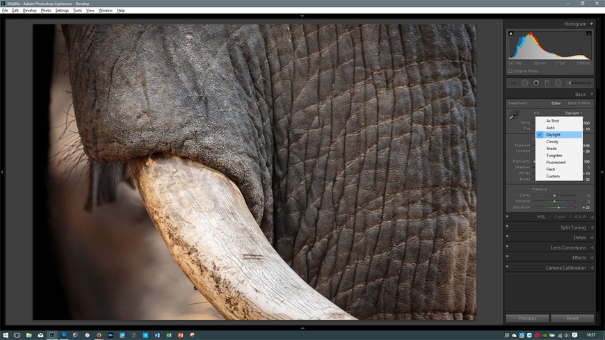
You camera will have a function labelled White Balance (WB). You can adjust this setting to tell your camera what type of lighting you are photographing under – there is usually a range of options such as Daylight, Shade, Cloudy, Tungsten, Flouorescent, Flash and AUTO. This tells your camera how it should represent WHITE in your images.
If you are shooting in JPEG mode, you need to get this right in the camera, since you have little latitude to adjust it on the computer later. If you are in RAW mode, I suggest you choose AUTO and let the camera make its best guess, and then adjust slightly on the computer if necessary.
Step 2: The Computer
1. The first stage in fixing colour on the computer is to ensure that the image is correctly exposed. I find that it is extremely hard to correct colour when the image is either too light or too dark. Take time to ensure that the brightness of the image is as you saw it when you were looking through the lens.
2. Then look very carefully at the image and assess whether there is a colour cast – i.e. do the colours look natural? Is there a yellow/blue/green/magenta tone to areas that should be neutral? This is a tricky thing to do, and I think it takes time to learn.
It’s also worth keeping in mind that we choose to shoot photos when the light is golden and soft, so we don’t necessarily want to correct all colour casts, as the colour of the light is often what made the image in the first place. So look for unnatural casts that were not present when you took the shot.
3. Don’t mistake colour saturation for colour balance. If your colours look washed out, don’t try to fix this with the WB tools. That problem should be repaired with ‘colour-neutral’ tools such as Contrast and Saturation.
4. Adjust the WB so that the colours look as they did when you took the shot – I find that selecting some of the preset white balances in Lightroom (found at the top of the first window in the Develop module) are useful in giving me an idea of what the colours look like. I don’t often settle on any of them, but it helps me to ‘see’ past the original image in front of me and see if there are improvements to be made.
5. Then adjust the saturation/vibrance to give the colour intensity that you saw. Don’t over-do this as everyone will see it a mile away!
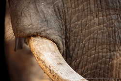
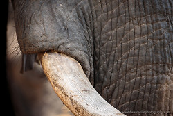
A Real-world Example
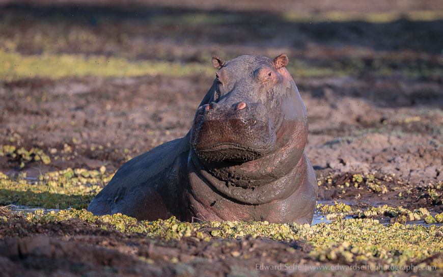
I am going to work through an example using an image that I took on a recent safari. My cameara was set to AUTO WB (as usual) and I snapped several shots of this hippo emerging from a gully.
To me, it’s clear straight away that the camera has not assessed the white balance correctly. The hippo appears too blue and too pink/magenta. The cabbage weeds growing around him are yellowy-grey, not green as they should be. This suggests that there are blue and magenta casts on the image. The colours in the image are also very subdued but that is perhaps because the image is slightly underexposed.
So I first used the exposure slider to brighten the image by +10. I then used the WB sliders to correct the blue-yellow cast by moving the temperature slider to the right until it looked correct. I then adjusted the Tint slider until the pinkish tones had reduced and the cabbage weeds had regained their correct colour.
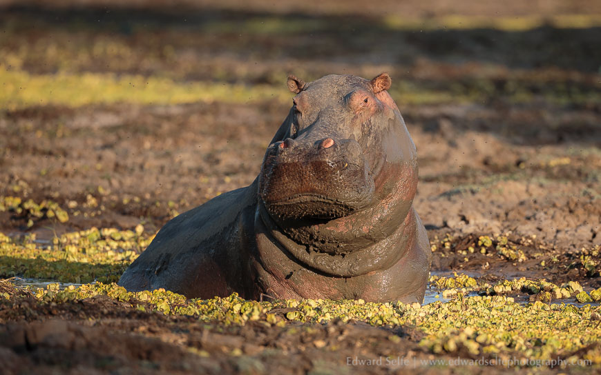
Finally, I tweaked the contrast to give the wonderful side-lighting that I’d seen in the field (I use a camera calibration setting in Lightroom which gives the most accurate colours but also flattens the contrast considerably, so I often need to add a little contrast back). If the colours look correct but flat, now is the time to add a little saturation boost. I rarely do this, but it’s occasionally necessary….but I always make sure to have the WB correct before I do.
If you have any questions about this process, or how it might apply to your photography, please ask in the comments section below!