We’ve all experienced it: you look through your camera, compose a beautiful scene, snap the shutter….and are disappointed with the result that appears on the back of the camera! Of course, this can happen for a number of reasons, but I am going to look at one of the most common in this blog: the problem of under- or over-exposed images, images which are darker or lighter than you intended.
It’s actually remarkable that your camera meters (measures the light levels) accurately to give you an image that is the correct brightness most of the time! The sensors and electronics required to achieve that are impressive. And, being a computer, the camera’s metering process behaves in an entirely predictable way; once we understand that, we can predict the result that we will get from any given scene.
The vast majority of cameras’ light meters ‘see’ in black and white; the meter ‘looks’ at the scene you have composed, assesses the brightness across the frame and exposes (a combination of shutter speed, aperture and ISO settings) to give you an an image that is the right brightness. It does this by averaging the brightness of the whole scene and equating that brightness to “middle grey”.
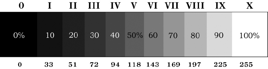
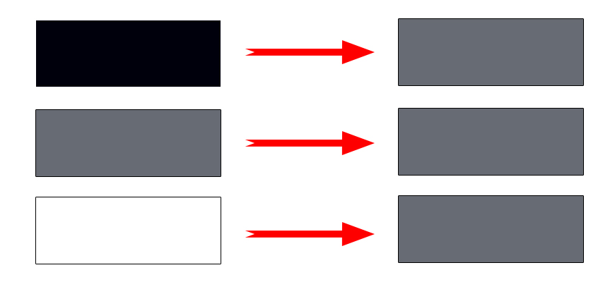
Middle grey is a tone (a brightness) that lies half way between absolute black and absolute white. Every time the camera meters, it measures the average brightness of the scene and chooses an exposure that equates that brightness to middle grey. The graphic below shows middle grey (marked as 50%).
The behaviour of the camera is best shown by a diagram: when the camera is faced with a very dark image – perhaps a blackboard, or a black ship – it tries to increase the exposure (brightness) to give an image that is middle grey in tone. Equally, if you take a photo of something white – perhaps a white car, or a piece of white paper – the camera will return an image that is far darker than the subject….try it: your white paper will be a dull grey.
This is not a fault. This is exactly how the camera is designed to work and, strange as this system may seem, it is entirely predictable.
So, we have established how the camera behaves. But in real-life situations, we are unlikely to be shooting images of plain black, white or middle grey subjects! So we have to apply this to everyday use. Go back to the idea that the camera averages the scene and places that average on middle grey. Let’s consider a chess-board which is half black and half white. The camera will assess this scene and take an average – this average will be middle grey (50% white and 50% black) so the camera will return an image which is spot on, because the average brightness of your scene really is middle grey! You white squares will be white and the black ones will be black.
The trouble comes when you have an imbalance of light and dark tones in your image. And ironically, it is that imbalance which often makes an interesting scene in the first place! If you have significantly more light areas in your image than dark areas, the camera will take an average of the scene and try to set that on middle grey. In doing so, it will return an image that is darker than you would want. The reverse is also true; if you are photographing a scene which has a large percentage area of dark tones, the camera will likely give you an image which is too bright.
Therefore, if you have an imbalance of tones in your scene, you may need to over- or under-expose (tell your camera to give you an image that is brighter or darker than it would have done without your intervention). For a more detailed look at an example image that needed considerable underexposure, read my blog about Impalas under the Ebonies.
For now, here are a few images that needed over- or under-exposure and a short explanation why.
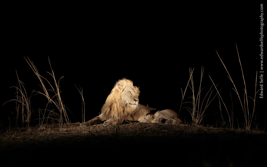
This lion shot was taken at night. The very large area of dark background of the image (which is not lit by the spotlights) would confuse the meter and cause the camera to ‘lighten’ the image considerably, in an attempt to get that black area to match middle grey. By underexposing 2 stops (-2 EV) I was able to override that, and create a correctly exposed image.
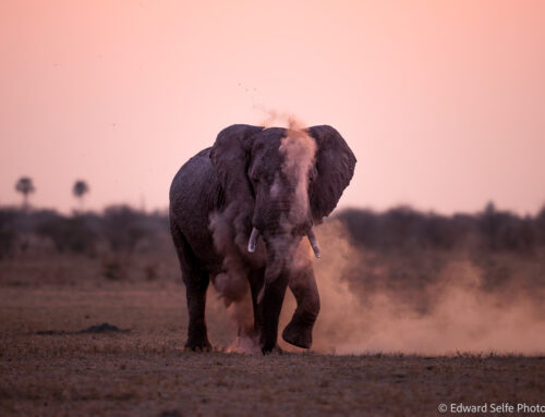
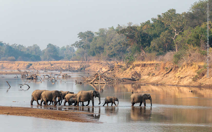
As these elephants crossed the river, with the light behind them, I adjusted my camera to overexpose my image. I had to do this because the very bright water, sky and sandbank take up a large percentage of the image area and would have caused the camera to give me an image that was darker than I wanted. Remember the white paper which becomes grey….? In this case, I only needed to use +2/3 of a stop.
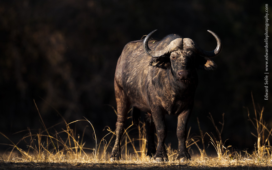
This image is similar to the lion above. The shaft of golden light that hits the buffalo, but not the background, is what makes this image interesting. But I had to use -1 stop to avoid the camera giving me an image that considerably over-exposed the buffalo.
[More advanced users will have been wondering if I will discuss different metering modes during this blog. Of course, choosing to meter from a smaller area of the scene will render some of these discussions redundant, but Spot metering (for example) has its own drawbacks too. I will write on this topic in the next blog.]
So there we have it! A discussion of why your images may not appear how you had intended when you look through the viewfinder. I use the over- and under-exposure function more than any other setting on my camera – it’s worth practicing with and getting to know how it works.